About the logo
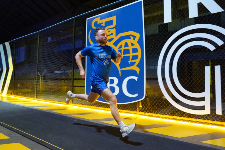
“Proudly Canadian” — This is a timeless version of a proudly Canadian logo. Supported by prominent text, strategically placed on top of a line acting as a wrestling mat, or the foundation upon which the sport is built. Symbolizing the rebirth of the sport, or the rising of a new era, as the maple leaf resides above the text and illuminates the silhouettes of the wrestlers in front. With a modern edge to its simplicity, this logo evokes promise for the future, and a level of podium prominence that comes with being a top performer.
Its use of negative space further adds modern detail, giving perspective and depth, making effective use of space and colour to ensure easy application to various surfaces or materials. The greater triangle outline of this logo integrates with the brand pyramid outlined in this guide. Its ability to visually connect with the deeper meaning behind the brand enhances the brand promise and gives it an enduring relevance to the brand elements behind the logo.
Please contact [email protected] for a copy of the brand guidelines if needed. Brand and website development for Wrestling Canada Lutte by Epic Branding & Design.